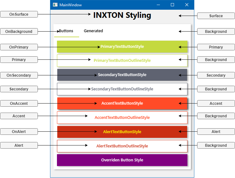
Buttons
Read more about buttons and user experience (UX) here
Primary buttons
Contained buttons are high-emphasis, distinguished by their use of elevation and fill. They contain actions that are primary to your app. User is guided towards the primary button.
Secondary buttons
Secondary actions should have the weakest visual weight, because reducing the visual prominence of secondary actions minimizes the risk for potential errors and further directs people toward a successful outcome.
Outlined buttons
Outlined buttons are medium-emphasis buttons. They contain actions that are important, but aren’t the primary action in an app.
Alert buttons
They represent irreversible action - Exit application, delete a record, dangerous action

Usage
<Button Content="PrimaryTextButtonStyle" Style="{DynamicResource PrimaryTextButtonStyle}" />
<Button Content="PrimaryTextButtonOutlineStyle" Style="{DynamicResource PrimaryTextButtonOutlineStyle}" />
<Button Content="SecondaryTextButtonStyle" Style="{DynamicResource SecondaryTextButtonStyle}" />
<Button Content="SecondaryTextButtonOutlineStyle" Style="{DynamicResource SecondaryTextButtonOutlineStyle}" />
<Button Content="AccentTextButtonStyle" Style="{DynamicResource AccentTextButtonStyle}" />
<Button Content="AccentTextButtonOutlineStyle" Style="{DynamicResource AccentTextButtonOutlineStyle}" />
<Button Content="AlertTextButtonStyle" Style="{DynamicResource AlertTextButtonStyle}" />
<Button Content="AlertTextButtonOutlineStyle" Style="{DynamicResource AlertTextButtonOutlineStyle}" />
<Button Content="Overriden Button Style" Style="{DynamicResource PrimaryTextButtonStyle}">
    <Button.Resources>
        <Color x:Key="PrimaryColor">Purple</Color>
        <SolidColorBrush x:Key="Primary" Color="{StaticResource PrimaryColor}" />
    </Button.Resources>
</Button>